Thursday, May 5, 2011

You Can't Miss: I make my case and D.Ro's graduation announcements

(Again, once I get to the lab, I will update this with photos.)

1. Colourlovers. This place has some neat entries and apparently they are expanding which I am sure is very exciting for them - mostly because I read that it was. For this post, I wanted to highlight the entry about imakemycase.com.

For those of you who have iPhones or blackberries, you'll want to check this out! This site allows users to create personal designs for their phone cases. Some of them look really amazing; I might spend some time decorating my own while dreaming of the day I get a new
phone.

2. Danielle Rodabaugh is ah-mazing. How she manages to crank out her designs for class and stay on top of her personal life, I have no idea. I had wanted to design graduation announcements and gave up due to my lack of time for anything (seriously, I would go into detail, but I think most of you are in the same boat). She, however, designed some fantastic postcards that she then let me steal and manipulate for my own personal use. I of course, gave her a shout out on my card. Check the before and after below.


Response: The last semester

This past semester has been incredible. I say that with every connotation of the word because I don't mean it to sound purely positive. There has been so much going on, and I have wanted to cry sometimes (usually in the design lab when I have whatever our version of writer's block is or when I go home at 3 a.m. and cannot fall asleep even though I have work in six hours). I have, however, really enjoyed getting to know our class. It is a shame that it took four years for many of us to get to know one another, but I am glad we eventually did.

I have been so inspired by the things our class has created. The competitions, while sometimes a nuisance, amazed me each time as we all created something different. I have learned a lot from many of you who have greater knowledge and experience than I do when it comes to design, technology and the like; and I appreciate your patience as I have asked so many questions throughout the semester.

I am leaving with a lot more than I had anticipated. (Firstly, let's not go there quite yet. I have a lot to do before next week.) These mini-portfolios might be my demise if I have to scramble to finish them, but I never imagined I would have enough to fill 40 pages. I have very little experience and less clips than many of you, but I will be happy to present my full booklet next week. Some of these pages make me feel very nostalgic for those late nights (well, early mornings...) in the design lab. Someone will have to commit to Skype-ing me at 1 a.m. for the first few weeks after graduation until I get a normal sleep pattern back.

Thanks for a great semester and for all of the things you have taught me! You are all super.

Critique: Murder Covers

So, last week I created three murder covers. I wanted to focus on the things that came to my mind (and the minds of those I polled) when I thought about murder. I can't say that any were particularly imaginative because we all came up with similar ideas.

The ideas I executed included scene-of-the-crime themed elements such as evidence cards, a chalk outline and the morgue. (I may watch too much NCIS.) The feedback I was given was to combine several of my ideas, such as the words "murder," "mystery" and "mayhem" and the chalk outline that was so clearly inspired by "Anatomy of a Murder."

This is where I will post this combination. (As I am in the library and unable to connect to the server.)

Wednesday, April 27, 2011

You Can't Miss: Earthday recyclable crafts and

Colourlovers goes green with this crafty Earth Day post. In the highlighted book ReMake It, shirts are made into cute buttons and a purse (you know, you could even put the buttons on the purse. Check out the post for specific instructions.

I like looking at the examples and diagrams of each step. For Infographics, we had to illustrate "how to tie a bow tie." It was pretty difficult. So I admire the clear steps given.


This helpful graph is from GraphJam – a site I love. It has some really fantastic informational graphics that I can so easily relate to. I love it. Check out the site for more hilarious pie charts and more.

Response: Personal branding

So, I struggled a bit with this branding idea. I wasn't sure what I wanted to do, and I didn't have any past examples of this type of work. So, I started from scratch and chose some colors and patterns as well as a font that I liked. I created my mini portfolio cover and a wireframe in Illustrator ... I will eventually transfer this to Dreamweaver (but I have yet to conquer that program, so I need to figure that out).

I plan on using these colors and design elements throughout my mini portfolio. I am thinking I will need to find another font to pair with this cursive one. I will use the cursive one for titles and the other font for any description I add to the portfolio.

Mini portfolio cover:


Portfolio wireframe:


Critique: Modern Midwest website wireframe

Ok, so I spent a lot of time working on this wireframe (as did Joe). Literally, hours of my life were dedicated to carefully constructing this –

Modern Midwest's home page (in theory):


And this (Nightlife page):


Truthfully, it was a lot of work. I spent a lot of time bringing in the elements that Michelle had created for us to use in print and working them for the page. Mainly our fonts and color palette was brought in. I also layered two bars from our magazine to create a divider at the top of the page.

Joe created the content on the main bar of the home page – the featured content viewer turned out great. He also created the tabs at the bottom of the page.

I made the template for the pages and put together the side bar content we were given after google-searching for images. I also googled all of the ads I placed.

My favorite part to design was the "subscribe here" ads. I made three versions that I placed throughout the pages.

Maybe someday I will place the "before" version of this site for comparison. Really, the basic frame we were given wasn't as horrible as I thought it would be. All the pieces were there. Joe and I just had the task of making it look more visually appealing.

Wednesday, April 20, 2011

You Can't Miss: RGB Wallpaper and the Evolution of the Hipster


RGB Wallpaper:

I was looking through the archives of the colourlovers' blog and found this post about wallpaper. I don't know where in my life I would be able to hang this, but it would be pretty cool. It's pretty fascinating to see how different images are more prevalent with the different lighting. I would say that the combined effect is by far my favorite. (And regular lighting would be much easier on the eyes.)

The post also talks about wall art made available by the same process of overlapping three layers – one in red, one in green and one in blue (but you knew that). The art is based on playing cards, and there are several prints of the strange combinations created by mixing these colors.


Evolution of the Hipster:

Looking at the monsteractive blog, I found an entry about infographics. Having previously taken that course, my general interest was sparked, and I took a look at the collective list.

I pulled "The Evolution of the Hipster" for you all to look at. It was one of the more fun options and made me laugh. I love the pull outs with the arcs and the typography. It is really wonderful. I also love the staggered poses of the hipsters – it truly becomes an evolutionary set up.

At first this reminded me of the 30/30 story that we just designed, but somehow they manage to make this an infographic and not just a design spread – though I would have found this truly inspiring for that week. Love, love, love. Enjoy.


Response: Blog feedback

So, yesterday we discussed our blog designs and purpose. That was fun.

I agree with everyone who said they like the "You Can't Miss" entry. Some weeks, I have a hard time digging around the interwebs enough to find something cool. But, I always find something crazy awesome on everyone else's blog.

I think that these blogs are a great way to track our design projects and progress over time, but I also think that some of the portfolio websites that others have would function just the same. For now, blogging might be a way for me to push myself to keep up on projects because my plan is to go home for the summer. And, depending on the job market and what I end up doing, I can see myself directing potential employers to this blog to check out my work.

If that is going to happen, I would like to re-vamp my blog.

Some feedback about my blog:

Font - needs to be changed
(I am eventually going to join the group of people who have already or are planning to create a banner for the top.)

Color - too many colors of display type that doesn't really make sense
(I have no defense for this. I put something up for that first time and haven't touched anything since.)

Black boxes - can be distracting
(I actually don't know how to change this, I think it came with whichever template I chose. I understand that sometimes it doesn't look the greatest, but I think other times it helps - especially when there is no clear edge on a photo or a spread. This box can help define that.)

Photos - some are large enough, others need to be clickable to enlarge in a separate window
(Again, I am not entirely sure how to do this. So, I don't really know how this is supposed to work. I will try to figure it out.)

Name - should change if kept up after graduation so it doesn't directly relate to the magazine
(This will be an interesting process as I am not the best wordsmith. Any suggestions?)

Right now, my action plan is to make my blog look more intentionally designed. For the duration of this class, I am going to leave all my entries as they are. Afterwards, I will probably chop a lot of the text.

Critique: First Department Page with Ads

This week was the first week that I had to design with an ad. In fact, I had so little copy, that I ended up getting another ad placed on the page to take up some room.

The ads created some challenge in arranging all of the elements on the page. It took me awhile longer to really work everything out.

It didn't help that I didn't get to Vox until after 3. (Fun back story, someone used packing tape and duct tape to shut me in my room. As I didn't wake up until 12 or so, I had not noticed. It was a hot mess that I would be happy to regale you with some other time.)

*Photo courtesy of a resident who thought this was funny enough to take a picture. (But not serious enough to check if I was inside...)

**I will post my department page once I get a copy of it that I can upload.

Wednesday, April 13, 2011

You Can't Miss: "Raw Color" and inventions that encourage laziness

Raw Color:

Colourlovers reviewed a branding project titled "Raw Color."

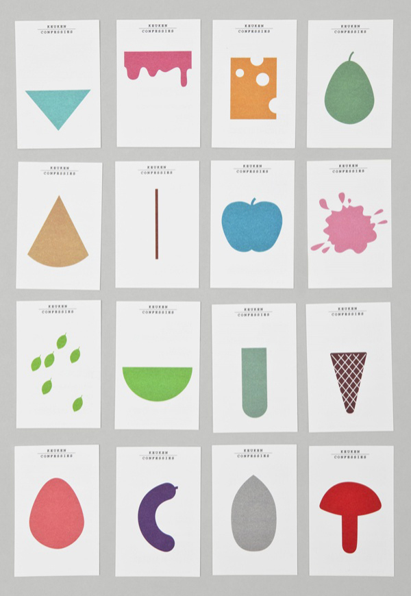
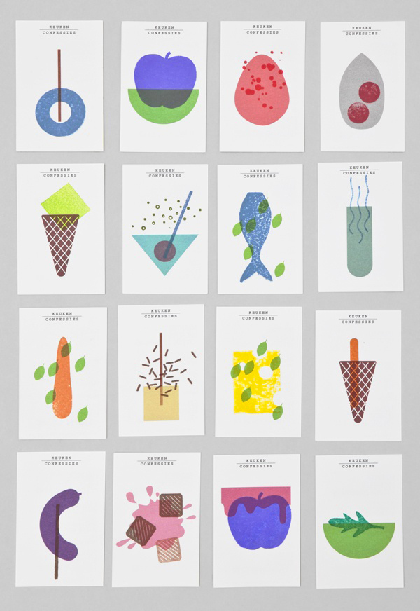
The images themselves are so great and colorful and the simplicity carries a really strong and fun message of what each shape is and represents. The brief description of the project and the reasoning behind each of their type and illustrative choices was really interesting for me to read. They wanted independent shapes that could stand alone or be paired together. It was also mentioned that they wanted it to be playful. Mission accomplished in my book. Check out the link above to see some of the placement of these shapes on products and stationery for this company.


Inventions for the lazy:

Now to be fair, many of these inventions are cool (Remember the t-shirt tea bags I covered earlier? They are mentioned.) and quirky, I am just highlighting a few that make me laugh.

NedHardy.com just lists this entry as "34 Cleverly Designed Inventions."

Here are some that I found funny:

<< A TV-tray like device for your keyboard. For those mealtimes when you just can't leave your computer. You know what I am talking about, designers.


<< A hook to dunk Oreos (or Oreo-like cookies) into milk. Keeping your fingers dry and giving you the ability to submerge the entire cookie, reducing the number of times you have to dunk.


<< A teapot holder that allows you to easily pour hot beverages without must wrist movement. And who wants to hold such heavy and possibly boiling hot objects?

Response: Modern Midwest Final Countdown


Our design team has been working really hard to get things turned around really quickly, but our publishing counterparts don't seem to have quite matched our enthusiasm for timeliness.

Working with what we have, we put together some really stellar stuff. I think as a complete package, Modern Midwest is really coming along.Thisweek I updated my feature and put some finishing touches on my department. Art really put me behind on both of these spreads, so now, having things to work with has really made a difference in my ability to put things together.

I still have some finishing touches to make to really polish these up, but I am pretty excited to see it all coming together. I feel like we are seeing the end of this project, which is so great. And I am excited to see the whole package printed together.

Critique: 30/30


I chose one of the younger subjects because I think it really hit the idea of youth who are influential. This photo struck me as an ordinary-looking kid who one would not necessarily attribute a lot of importance to. I think that most of these individuals seemed that way, so he represented the group by having some mystery as to his importance.


While I like the typography for my splash page. I really would have liked to figure out a way to make it a little more colorful and exciting. It fits with the rest of my design, but this spread has so much room to breathe that it makes the next page look really cramped.


I have never worked with so many cut outs before, and I found the photo styles to be inconsistent. When part of the subject was cut off, it made for some tricky maneuvering while designing to ensure those photos did not look odd. I used lines to create labels for each person, and to make some of the crops look more natural.

With a large number of small stories that all varied in length and style, it was really important to me to make them look as cohesive as possible. I found the copy to be the most challenging part to work with. I really like how my display text turned out and the photos, but I definitely would have liked a different organization for each story.

Wednesday, April 6, 2011

You Can't Miss: A New Color Wheel and Noteslate

Colourlovers explored an array of gray on April Fools Day, and posted this "helpful new color wheel." The blog explored reasons to use more gray - saving money, time and emphasizing the overlooked and underused. There were even photos of an elephant's butt, a mustache and beard, and a gray sky to really show off the color.


Noteslate is this cool new gadget that is essentially a drawing tablet that one can take notes on. I think that it would be a really awesome thing to have when trying out ideas for new designs. Being able to sketch it out on a grid or sample some illustration designs would be so convenient! Not only does it act like pen and paper, but you can save and share your pages. Cool, right? Some of the models even have different color choices for the pen (just at a click of the button.)

Response: Photojournal

So. We had to take a picture every day. I had a difficult time thinking of truly "inspirational" things to take pictures of, so I sort of documented the different things I did all week.

I spent a lot of time working on homework, so I was on the couch a lot listening to Ally McBeal in the background. I also went to my high school a few days to help out with the yearbook and use their computers to photoshop by brother's senior pictures.

My brother on his first day of school. I photoshopped the photo for his graduation invitation. He was rather pale and washed out in the photo, so I made a much progress as I could from the scanned-in photo.


Over break, I was responsible for creating almost 400 invitations for the Prom event that my residents are planning for my building. Twelve hours or so later, I had a large box of masks and itchy eyes from all the feathers.


It was pretty cold throughout most of my break, even when it was sunny, it was windy and chilly. On Sunday, when I drove back it was so nice. I took this photo in my parking garage on campus. I thought the windows framed the day beautifully.

Critique: Typography Assignment

My mom was really excited about this project. She went all around town with me to take pictures of different signs and kept thinking of more places. After 15 photos, I thought I had enough. I have 28.


The ones I used to create this sign (taken from West Park...) are from the high school, an auto shop, The Bar (literally, that is its name), a church sign, the fire department, and a vegetable stand (one of those signs with letter cards that change out).


I like the way the colors worked out, but I think in general this was a tough assignment because I feel like the letters don't really work together in the best way. It might have helped to have more recognizable typefaces. The "w" is used a lot in town, but I doubt a lot of people would be able to match the others to their signs.


Wednesday, March 23, 2011

You Can't Miss: Clients From Hell & webdesignerdepot business cards


Clients From Hell.
colourlovers.com reviews another book. This one looks hilarious. It almost reminds me of working with editors on deciding what a story needs to look like. There are so many opinions out there, and sometimes we have to be such people pleasers that we have to be.


Check out the business cards on webdesignerdepot.com. They are so creative and useful - great examples of content-driven design. For example, below. Not only are these super cute, but they are useful and really show off the personality of the artist. There are some other great examples of design work on this site as well, but the business cards really caught my eye.


Response: Modern Midwest Prototype

Shindig: I think there are some really great concepts that will come out of this design. It would be easier to talk about if we had been able to see more of it. I think some of the illustrations may need reworked and should accompany photos when possible to keep with the more realistic, tangible designs throughout the book. I think using some of the elements seen in the photos from the blog could make the interview page really fun.

Nosh: Nosh seemed really put together. The prototype was so clean and fresh (not to sound cheesy). I agree with a lot of the comments the team made about the length of the copy being cut. I really like the breathing room that the magazine is striving for. There may be a lot of departments, but I think the entire team (publishers included) should look into making some features that really differ from the rest of the magazine. The pages look great, but they all look so similar.

Cupboard: I really like the bar and the logo, I think that that concept should be carried throughout the magazine as department heads or info boxes or something. I think there was some inconsistency with the design. I also think the font choices are great because they are so simple and so readable, but I think it needs some excitement.

Plaid Dad: I think that this magazine is struggling with the same art problems that Modern Midwest had. I like some of the options that the group cam up with for their logo. I think it can be condensed a bit more and other possibilities should be explored. Some of them looked really great. I think once art is figured out, things will seem much more personable. Adding people into the spreads could also help.

Critique: Modern Midwest Prototype

Modern Midwest Prototype.
Working on our prototype was super tricky. I had a lot of ideas, but very little direction because we didn't (and still don't) have art. So, now we're scheduling photo shoots and working on getting ideas for our features.

Below is an example of a department page. There are a lot of ideas to incorporate into this spread. One I am excited about it illustrating a map of the Midwest and each of the bars - either a cutout of the building or a special drink they are well-known for.


We have a lot of different ideas for our features. The two I am working on – Date Night and Style Blog, will need some adjusting. I think Date Night will expand to a four-five page spread, and Style Blog should be cut to a two page spread, three max.


Wednesday, March 16, 2011

You Can't Miss: The Smashing Book and Designer's List

Colourlovers' blog is featuring a book review of The Smashing Book #2 and promoting a giveaway of the "super fantastic" book. The review highlights some of the chapters which includes chapter 2 "Visible and Invisible Design."Below is an example (I adore) from this chapter.


Oh, stumbleupon. This site has been great as I have been searching the web for the next fantastic thing to bring to you all. I can honestly say I am excited about this one and have marked it (among few others I have mentioned earlier) as a favorite. Below is an example I found from logofaves.com.

Designerslist.info is really cool. It is essentially a list of links to a crazy amount of websites that are all about design - and they're broken down into categories such as blogs, inspiration, logos, fonts, color schemes, etc. Some of the sites I have already featured like Dribbble and of course colourlovers are listed in a few of these categories. Check out some cool new resources, friends.


Response: Travel Issue

The last two weeks have been a crazy mess. Our team worked on more aspects of the magazine than I think we had originally anticipated. With three features (at least originally), department pages, design elements, the table of contents and calendar to design, we had a lot on our plates.

In some ways it was helpful to have four people working on everything - there was clearly a lot to do and delegation was key. But other times it became difficult to find a time for all of us to be free - especially when we depended so heavily on the editors. Working through miscommunications and often with a lack of content and art, we managed to put together our vision for the issue.

We took on a larger role than our usual designer one. (Huge shout out to Tanya and Nicole! They put in a ton of hours with the department designers and had a lot of set backs with their feature, but they handled everything beautifully.)

I am actually really looking forward to tomorrow to see how all of our work turns out.